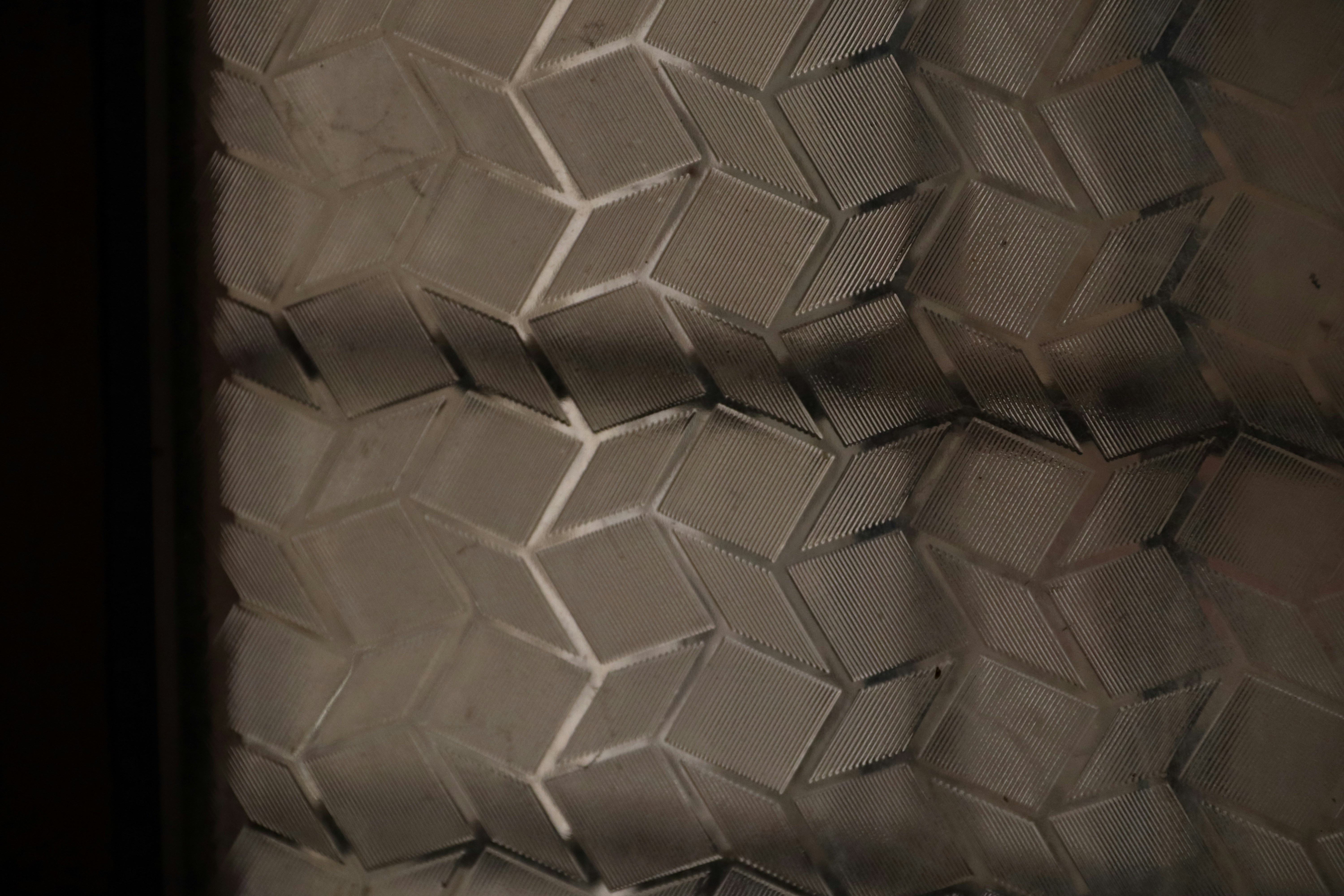
September changes how people see their homes. Summer distractions fade as school schedules, work rhythms, and fall entertaining return. Rooms that felt fine in July suddenly look unfinished or exposed. Glass is often the culprit. Windows, shower doors, and cabinet fronts reveal clutter or invite outside views once daily routines resume indoors.
Decorative window film solves this problem, but only when the film pattern matches the room. Wrong choices happen constantly, whether from rushed DIY projects or installers who skip the design conversation. This guide walks through six spaces and explains which pattern actually works.
Bathroom Film Pattern Choices
Start by identifying the bathroom style. Is it traditional, transitional, or contemporary? Next, consider the color palette: warm neutrals, cool grays, white, or bold color. Finally, decide whether privacy is needed at the shower door, the window, or both.
Traditional bathrooms with subway tile and chrome fixtures suit classic frosted film. Contemporary bathrooms with floating vanities and matte black hardware benefit from clean, geometric patterns. Rain glass film works well in either style since its organic texture avoids a specific decade. Avoid heavy botanical or novelty patterns here. Busy designs overwhelm a small, intimate space instead of elevating it.
The Home Office
Home offices raise a different question. Does the glass serve as a video call background, block interior sightlines, or both? Furniture style matters too, whether traditional wood, modern white, or industrial metal. If video calls are the priority, choose uniform frosted film with 60 to 70 percent light transmission. It creates a bright, diffuse backdrop that reads as architectural on camera. If blocking family traffic matters more, lower transmission or gradient film delivers full privacy while keeping natural light. Skip patterns with strong visual movement, like wavy or bold organic designs. Camera compression turns them distracting instead of polished.
The Kitchen
Kitchen glass shows up in several places. Cabinet fronts, a window over the sink, or a pass-through opening each need separate consideration. Cabinet finish also plays a role, whether painted white, left natural wood, or finished in a dark stain. Glass cabinet fronts pair best with frosted film matched to the cabinet tone. Light cabinets call for higher transmission film, and dark cabinets can handle a slightly lower level. Sink windows benefit from gradient film, opaque near eye level and clear above it.
This keeps privacy during use while preserving the view outside. Geometric patterns should be avoided on cabinet glass. Their regular lines compete with the grid formed by pulls and drawer slides.
Commercial Conference Rooms
Conference rooms answer to brand identity first. What is the company’s color palette, and is the goal privacy or aesthetic separation? Culture matters as well, since formal firms and creative companies make different choices. Law, finance, and consulting firms usually prefer classic frosted film or subtle linear patterns. Creative and technology companies can use bolder geometric designs that express their culture openly.
Gradient film suits rooms where a visual connection to the office should remain. Logos require large glass panels to read clearly. Small conference room windows rarely work for branding, though reception glass often does.
Entry Sidelights
Entry sidelights depend on the home’s exterior style. Craftsman, colonial, contemporary, and transitional homes each call for a different look. The goal might be privacy, curb appeal, or both together. Craftsman homes with wood detailing suit nature-inspired patterns, such as bamboo or leaf textures. Colonial homes favor classic frosted or subtle geometric film that reinforces symmetry. Contemporary homes with clean architectural lines pair well with linear geometric or gradient film. Novelty patterns should stay off entry glass entirely. Street visibility means these choices must read as designed rather than decorated.
Neighbor Facing Windows
Bedroom and bathroom windows facing neighbors need a careful balance. How much light does the room require, and is any view above eye level worth keeping? Gradient film answers both questions well. It stays fully opaque near the floor, softens through eye level, and clears above six feet. People get privacy exactly where they need it. Sky and treetop views remain visible above that line. This option outperforms uniform frosted film in nearly every case for these windows.
September Timing
September offers a practical advantage beyond design. Contractor schedules loosen once the peak spring and summer rush ends. Projects booked now typically finish before fall entertaining season begins. Hosts can then welcome guests into finished spaces without a rushed installation timeline hanging over the calendar.
Choosing the right film pattern is a design decision, not a guess. A short consultation matches pattern, opacity, and placement to the room’s actual needs. Reach out to schedule a design matching consultation before the fall season fills up.